At (un)Common Logic, we believe a website isn’t just a business asset; it’s the first interaction potential customers have with your brand—and first impressions matter. Imagine a visitor landing on your site, eager to explore your products or services, only to be met with confusing menus, dead-end links, or a maze of pages that make finding information feel like a chore. Poor website navigation doesn’t just frustrate users—it drives them away, costing you valuable leads, sales, and opportunities.
On the other hand, a strong, frictionless, and intuitive navigation system does the exact opposite: it guides users seamlessly through your site, keeping them engaged and leading them toward key conversion points. Good navigation is more than just design; it's a strategic tool that influences user behavior, boosts SEO, and ultimately supports your business goals. That’s why our client, Hartley Law, looked to our team for the redesign of their navigation menu.
The goal? Create an intuitive navigation menu that reduces user friction and encourages user engagement with content and conversion pages to scale CVR.

Our (un)Common Approach: Strategic Navigation Overhaul
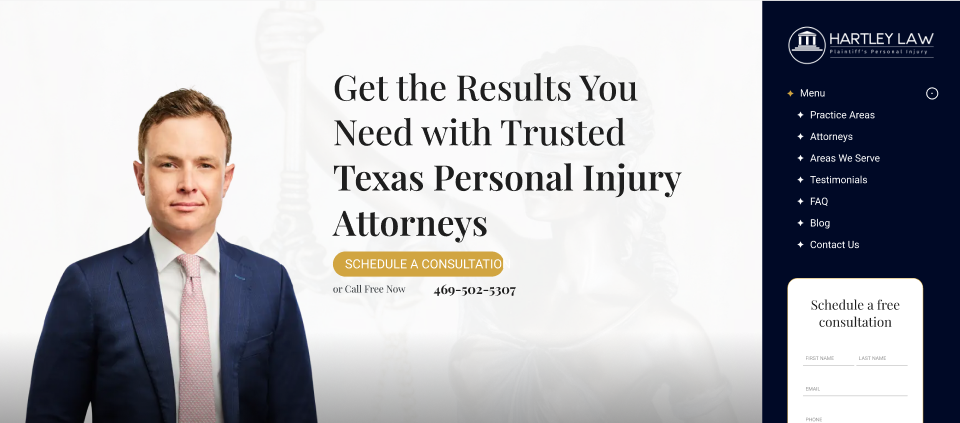
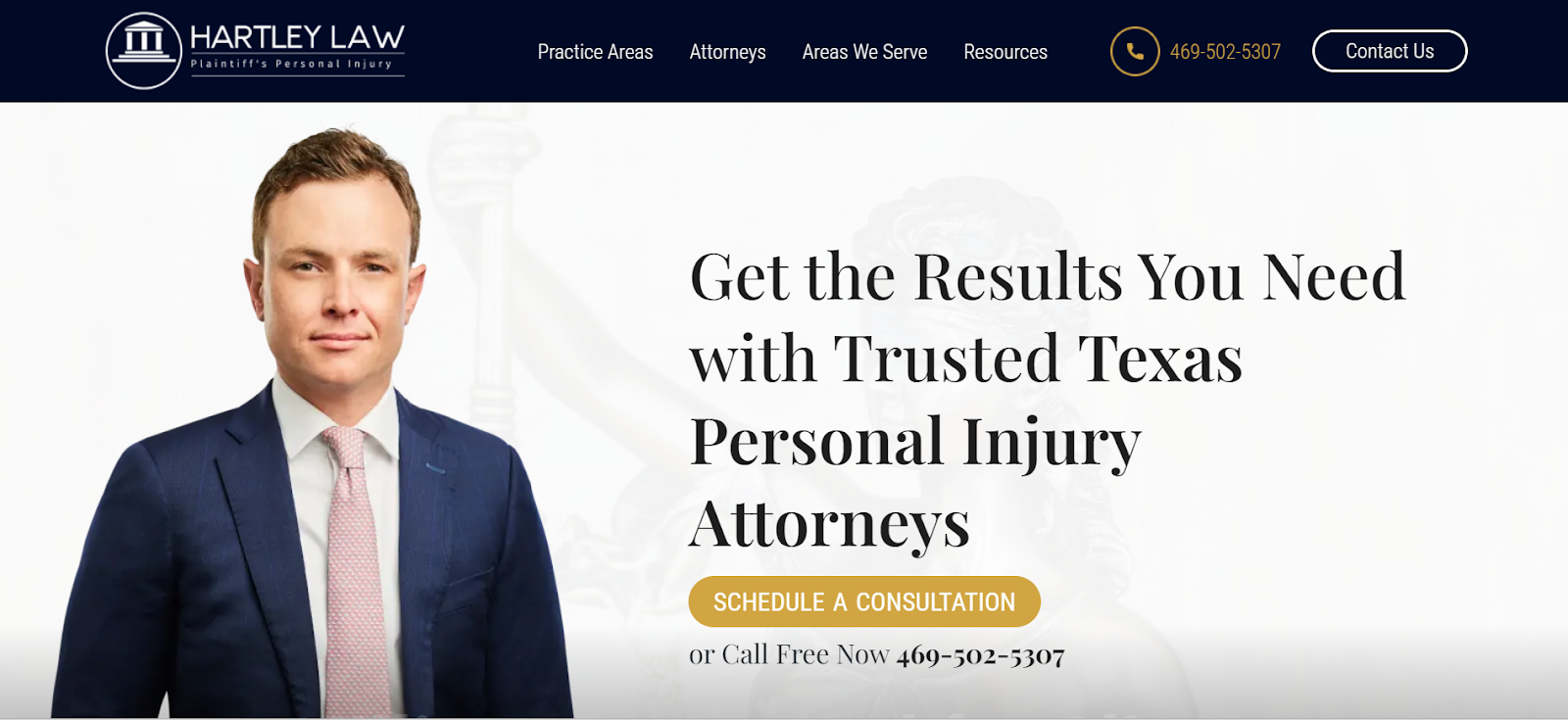
To achieve this, our team restructured the existing side navigation by relocating it to the top of the website, aligning with user expectations and making it easier to find. We streamlined the menu options, consolidating various resources like FAQs, blog posts, and testimonials under a unified “Resources” drop-down menu. This not only decluttered the navigation but also made it simpler for users to find valuable content.
To drive conversions, we added a prominent “Contact Us” CTA button directly within the navigation, clearly highlighting the primary action we wanted users to take. Additionally, the phone number was displayed in the menu, providing a secondary conversion option. To reinforce these actions, we kept conversion opportunities visible within the hero section, maintaining a consistent push toward engagement.

Testing and Monitoring: Measuring Success Post-Implementation
While A/B testing is typically our preferred approach for changes of this magnitude, the client was eager to roll out the new navigation immediately. To assess the impact, our team is conducting a pre vs. post-implementation test, tracking performance changes after the navigation update went live. Early results have been promising: the engagement rate increased from 79% to 83% within the first two weeks, a clear indicator that users were responding positively to the streamlined design.
Using tools like HotJar, we analyzed user interactions with the new menu, gaining insights into which menu options are most engaging. This data not only informs future conversion rate optimization (CRO) tests but also highlights content needs from an SEO perspective. While initial conversion rate (CVR) results are still developing, overall website CVR has already risen by 68.5% year-over-year. Interestingly, the introduction of new CTA buttons in the navigation menu appears to be encouraging a user behavior shift from phone calls to form fills. This will be something our team continues to study and likely craft additional tests around.
Next Steps: Continuous Improvement for Enhanced User Experience
With the new navigation live, our team will continue to monitor key performance indicators (KPIs) and user behavior to identify further testing opportunities. By continuously refining the user experience, we aim to drive even higher engagement and conversion rates, ultimately scaling results for Hartley Law.
Looking to enhance your website’s navigation? Contact us to learn how we can help you create a seamless user journey that boosts engagement and conversions.